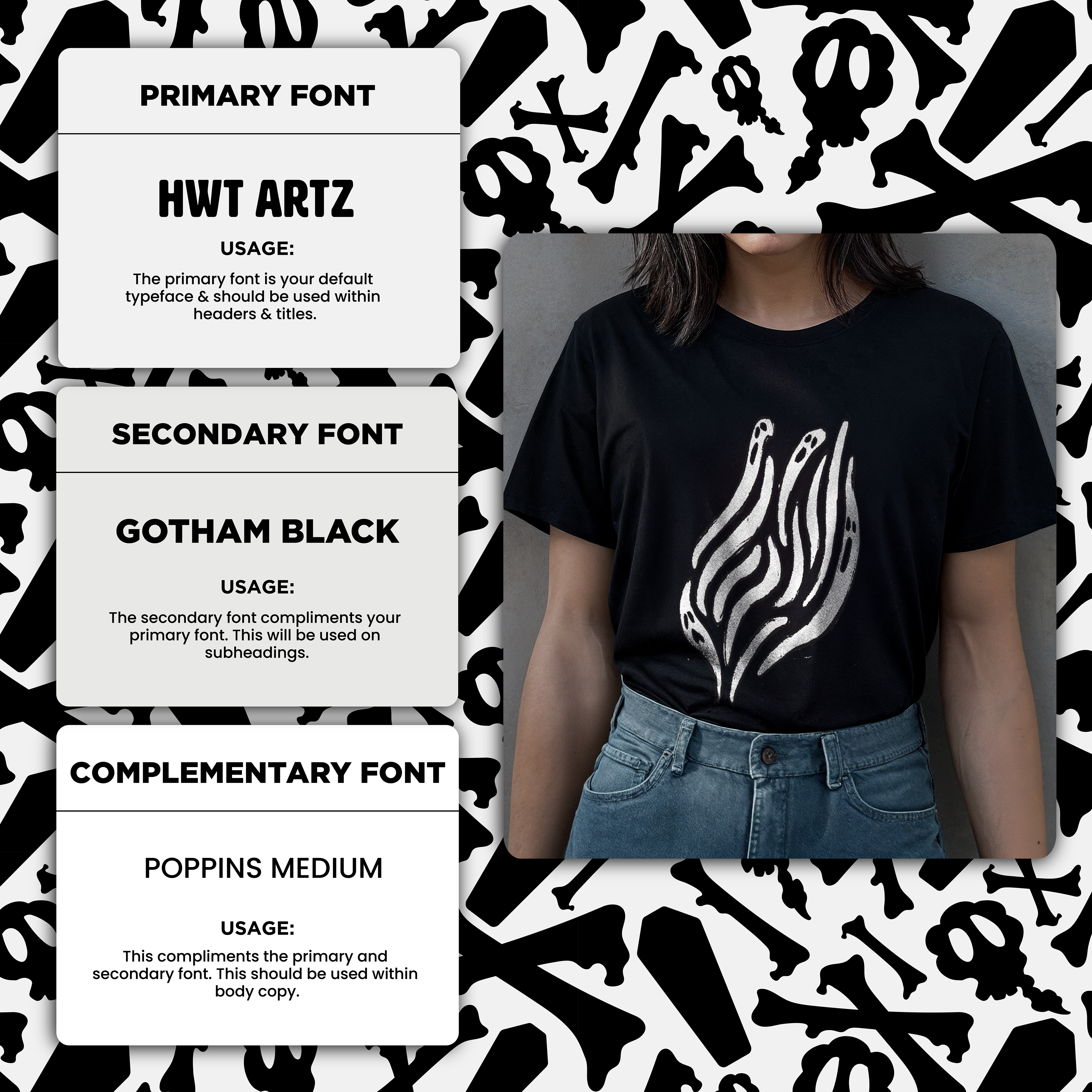
"Torn" is a concept for a grunge skate brand. The brand wanted to fulfill a macabre niche playing into the traditional counter-culture artistic styles common among skate culture.
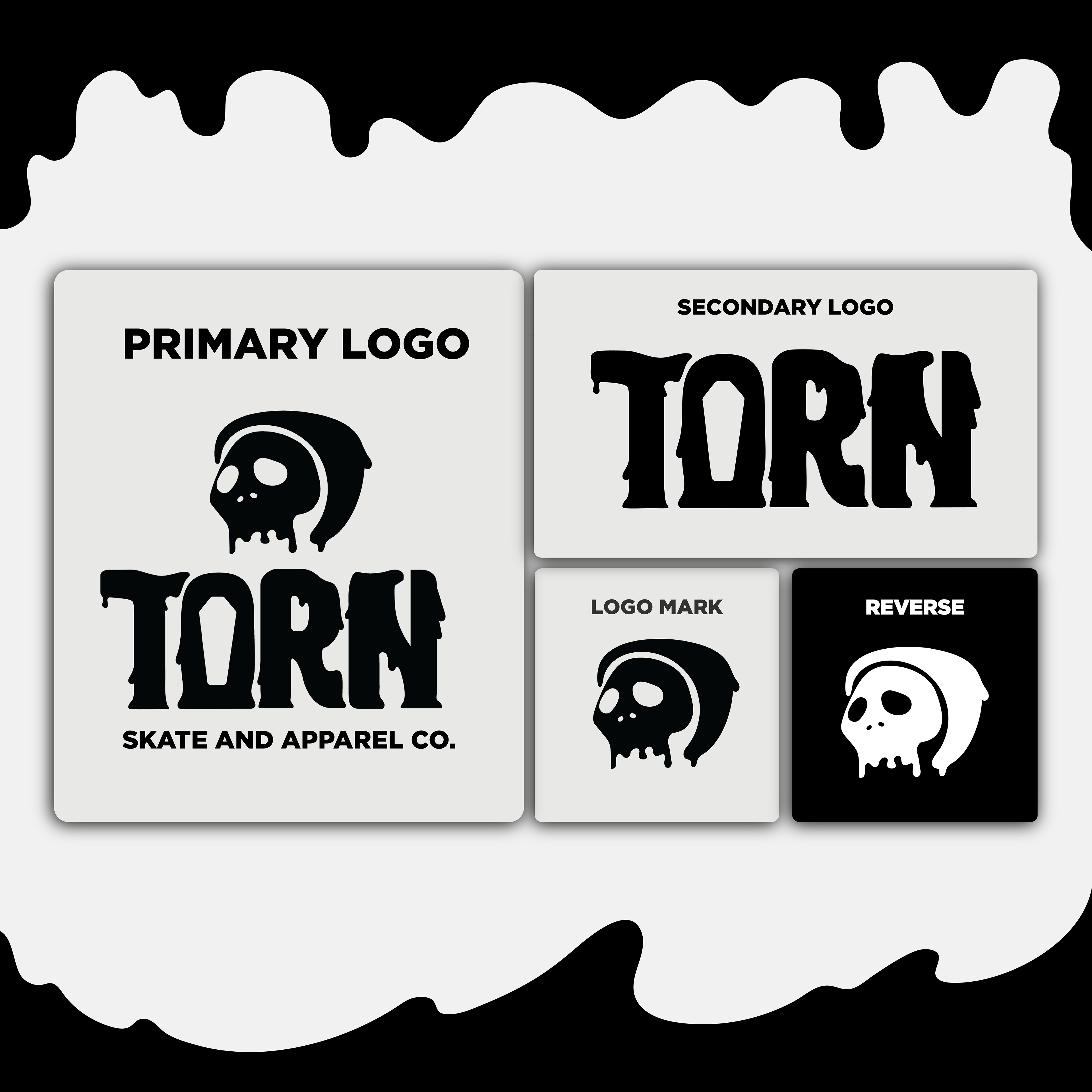
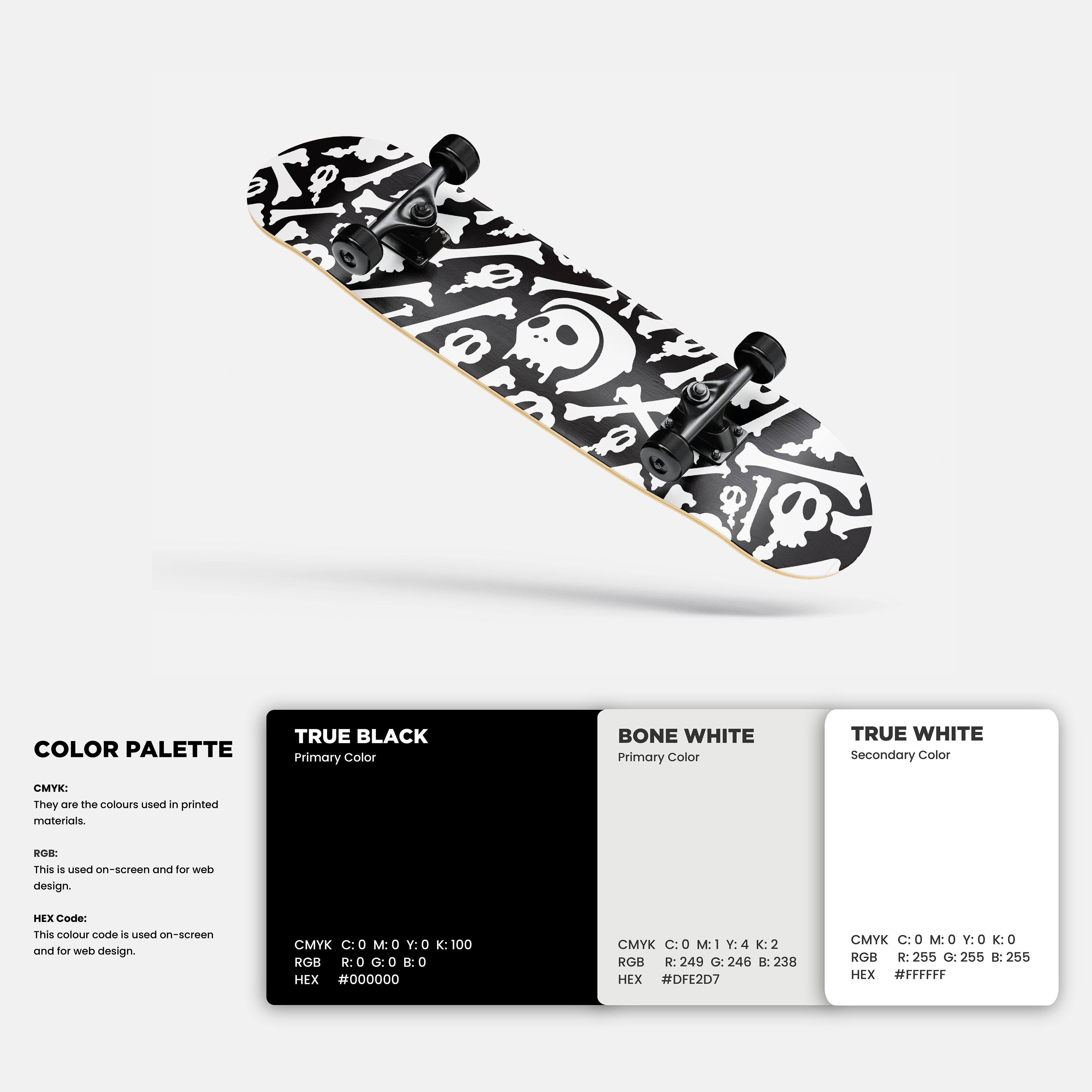
Throughout the design process, fluid lines, and exaggerated shapes became key traits of the brand identity. The monochromatic color palette helps keep the brand visually striking, and thematically consistent.
The font choices needed to resemble the same bold expression as the brand and its demographic. A refined sans-serif sub-header and body text help to take the brand to a more sophisticated look.